
This post will help you to fix this issue for:
- existing images
- for images that will be uploaded later on
- both for mobile and for desktop
- for different pages on your website, not only for that one that you’ve tested in GTmetrix
First, what does it mean?
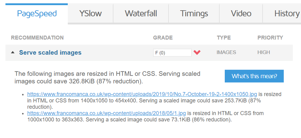
This ugly notice in GTmetrix means exactly what it’s saying: some images on the tested page were resized in HTML or CSS.
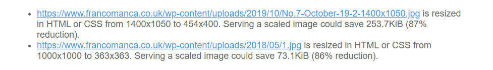
This is how it happened: they have an awesome picture of yummy pizza which they uploaded through WordPress Media Library. This awesome picture has a size of 1400×1050 pixels. But the maximum width that their post content ever gets is only 454px on Desktop devices (and even smaller on Mobile, obviously).
When someone views this page that original image is fully loaded on their device and then it gets resized in HTML or CSS to be shown in proper size (454×400 as you can see). This makes images look smaller but the file size does not change. So in this case, 2/3 of this image size is just a waste!
If they could serve this image exactly in the size it will be shown to the user, it’s size would be almost 3 times smaller!
It means that the user will need to load 3 times less data. Isn’t that cool?
And imagine showing all images on your website that efficiently?
Does it slow down the website?
Yes, it does. Fixing this issue can do miracles to your page size. Let’s do it!
What we are aiming to achieve:
- you upload an image to WordPress in any size without any worries
- it gets resized automatically to proper sizes
- images are served to the user exactly in the size they are needed (aka we are serving scaled images), which means the page weights less and loads faster
- all existing images are resized as well
- this is done for the entire website, both mobile and desktop versions
Quick note before we start:
The first 2 steps are fairly easy but will take some time, afterward everything is pretty quick.
Step 1: Check what kind of templates are used on your website
This issue often happens on archives/categories/taxonomies pages, homepage, on single pages/posts if you have related posts block.
To find out what image sizes are used on your website, first define what kind of templates are used on your website. For example, single post, archive template for tags, another template for categories, WooCommerce product page etc.
Make a list of URLs for each type. Use only those that have a different layout (for instance, if your category page has the same layout as tags page, include just one).
As an example, I took my single blog post page and tag archive page, so my list is:
https://sabrinazeidan.com/serve-scaled-images-WordPress/
https://sabrinazeidan.com/tag/site-speed/
DIY: Make yours!
By the way, I use my very own plugin to run site speed tests. Check it out:
Step 2: Find out that image sizes are used across your website
Now, when you have a list of different layouts, let’s check what image sizes are used there. We need to check both on mobile and desktop.as they will be different. So, in my case, as I have 2 URLs, I need to check 4 different views.
Your site will probably have a longer list to check. Also, in my case images are present only in the content container of the page, but you might need to check sidebars, related posts block etc and write down all image sizes variations that you have.
| Mobile | Desktop | |
| Single Post https://sabrinazeidan.com/serve-scaled-images-WordPress/ | 345*any | 740*any |
| Archive: https://sabrinazeidan.com/tag/site-speed/ | 350*242 | 227*200 |
To check your sizes you can use one of these two options:
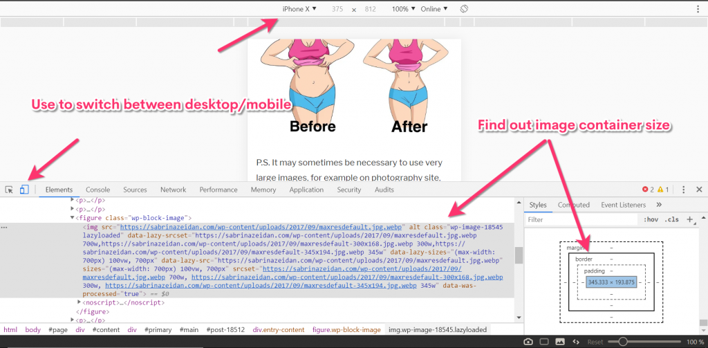
Option 1: Use Chrome DevTools
Use device toggle bar to check both Mobile and Desktop sizes. Examine images on your page to find out their container sizes .
Option 2: use GTmetrix
This might be easier in case you’re not familiar with Chrome DevTools.
When you run tests in GTmetrix it tells you which size is used actually.
So all you need to do is to run tests for all URLs that you have listed and write down the sizes. Mind running tests for mobile as well!
Pay attention to height, is it fixed in your layout? Or only width is fixed? For category archives, related posts blocks etc usually both width and height are fixed, but for single posts/pages it’s often just width that has fixed value, and height is adjusted accordingly.
DIY: Write down all the sizes.
Step 3: Make WordPress create proper image sizes for you automatically
Now when you have a list of all image sizes used on your website, let’s make WordPress do the job for us!
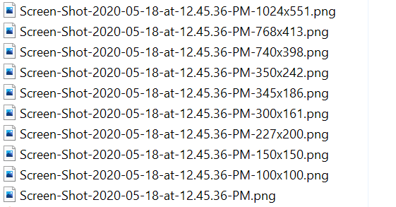
By default when you upload any image, WordPress automatically creates copies of it in different sizes to be nice and serve scaled images out of box. The problem is that those sizes default sizes don’t fit your actual layouts!
Now let’s make WordPress create the image sizes that we actually need!
We are adding theme support for our new image sizes, this goes in functions.php:
DIY: Add yours and mind to change dimensions accordingly!
BTW: If you want to prevent WordPress from creating thumbnails of the default size, remove those sizes as shown above.
From now on every image you upload will get an additional variation of those sizes that you’ve set (in my case it’s 4 of them). And when loading the page the image of proper size will be used 🙂
Mind that this won’t impact any of already existing images, it will only affect newly uploaded images. So images that were uploaded before are still served oversized!

Step 4. Fix existing images
There are tooons of topics out there on forums “Help! add_image_size doesn’t work! my images are not resized!”
In order to add new sizes to images that are already uploaded to your Media Library, you need to regenerate thumbnails according to your new settings. In other words, you need to create those images!
Use Regenerate Thumbnails plugin, it will do it for you just in a few clicks.
Profit!
Now to display an image to a visitor WordPress will pick the version exactly of the size that is needed!
This Responsive images feature was introduced in WP 4.4, so if you use any version that was released after 2016 (and I really hope, you do) you’re good to go, WordPress will pick the right size automatically for you.

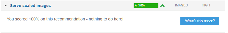
And if you retests it in GTmetrix you should get this nice line:
Few notes:
If it still sucks: re-check if proper sizes are used in your templates! I see this quite often in custom made themes: the size of the attachment is defined, but defined wrong. It’s set as medium, for example, while it should be something according to the sizes from step 3:
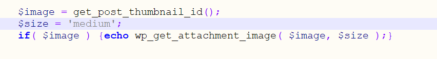
BTW: a quick tip to serve different thumbnail sizes for Desktop and Mobile in your templates:
$image = get_post_thumbnail_id();
$size = 'sz-post-desktop-preview';
if( wp_is_mobile() ) $size = 'sz-post-mobile-preview';
if( $image ) {echo wp_get_attachment_image( $image, $size );}
Don’t confuse scaling images and optimizing images!
Scaling images is about loading the image exactly of the size it’s shown to the user. It means resizing the dimensions of the image (in pixels). While compressing (sometimes called optimizing which is not correct) images means making an image to weigh less (in bytes) with or without loosing the quality, the image dimensions stay the same.
If you get this “Serve scaled images” warning about your logo or any other image that has a unique size (for example, payment logos in footer etc). There is no need to do all these, you don’t need other images on your website to be created in that size! Just resize that specific image with Photoshop, RIOT or even WordPress Media Library crop tool – whatever you’re comfortable to use, and replace old oversized logo with new one – lean and fresh 🙂
Sometimes you need a larger version of your images, for example on photography sites, online store, or even on blog posts if it’s schemes or infographics. In this case, make it opened by click. This way you will be serving scaled images, the user will be getting page content fast and if they want to see the larger version of the picture — it’s accessible as well.
If you need to resize images that are NOT attachments, that were not uploaded via Media Library, for example, they are stored as custom fields. Here you go.
Wrapping up
If you use images in the size larger than it’s going to be actually displayed to the user, you make them wait for these additional kilobytes (and sometimes, megabytes) to be loaded while they could have already been browsing your website.
Serving images of the correct size can make an enormous difference in page loading times. Feel free to share your results in comments!
Leave a Reply to Tanmoy Biswas Cancel reply